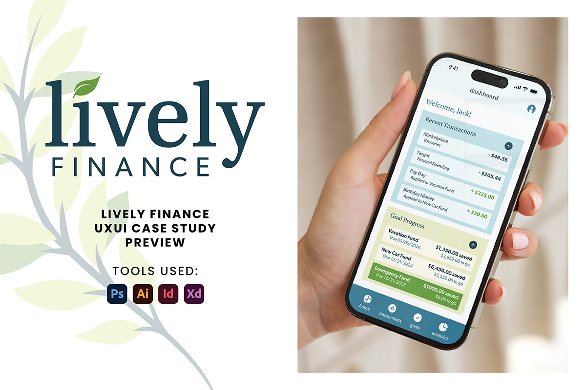
When I first started considering a project for a money-saving tool. I felt a little intimidated. After considering what would help me on a savings journey, as well as. Talking to some different people in my life I got excited about the various possibilities that could come in a money-saving app. I wanted to give my users an experience that was easy to navigate, easy to set and adjust goals, and easy to succeed! I took everything I had learned so far in my UI journey to understand my main purpose of my product, as well as develop user flows, sketches and wireframes, conduct user testing, and finally create final wireframes, mockups and prototypes. I believe I created a product that feels approachable, trustworthy, and includes interactive pieces that can help keep my user on track to reach their goals.
Check out
Lively Finance UX/UI Case Study
for my full process.
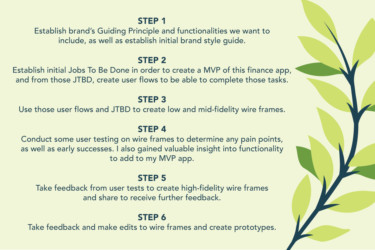
My Process
Ideation
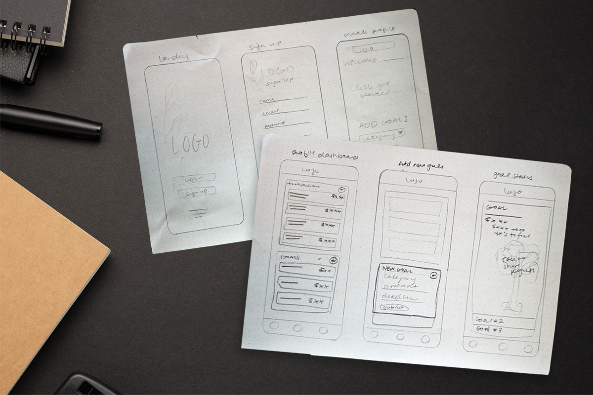
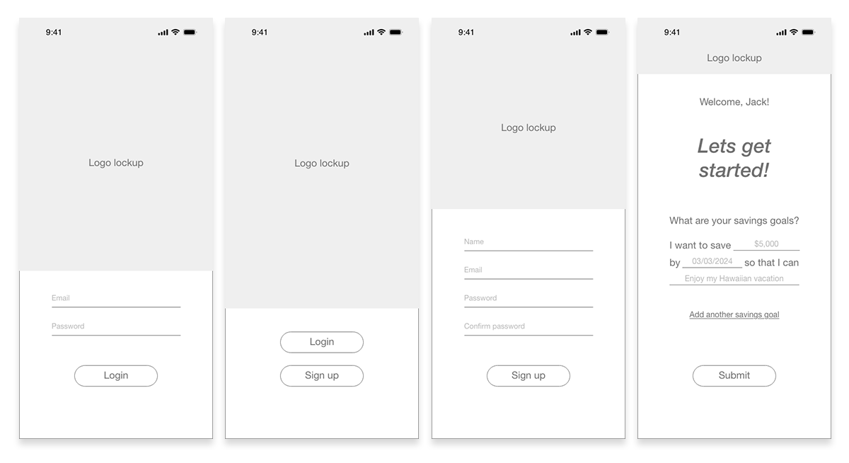
During the concepting phase of this project, I wanted to keep my primary focus on helping my users save money for a specific goal. I wanted them to be able to easily manage deposits, expenses and goals, and I wanted them to have a good time doing it. I created many versions of sketches and completed some user testing early in the process to make sure I was keeping user my top focus. I took those notes and created my mid-fidelity wireframes and conducted more user interviews.
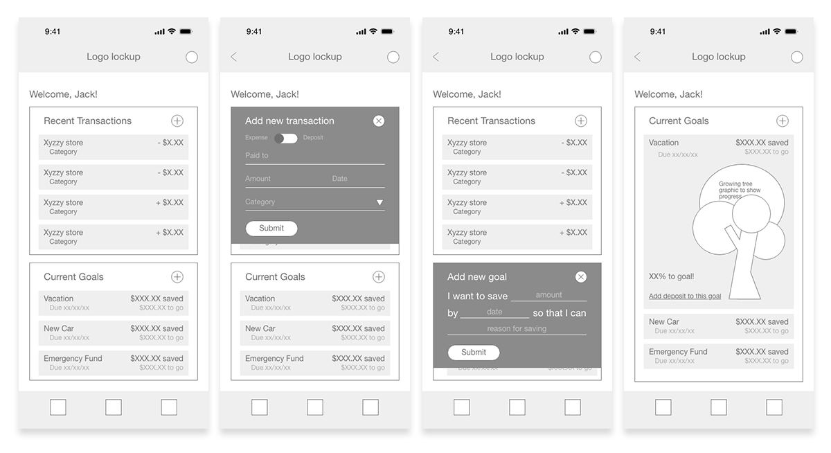
High Fidelity Wireframes
Once I felt good about where my mid-fidelity wireframes were, I refined my designs to be high-fidelity wireframes. I also added some frames that felt like they would make the users experience more seamless.
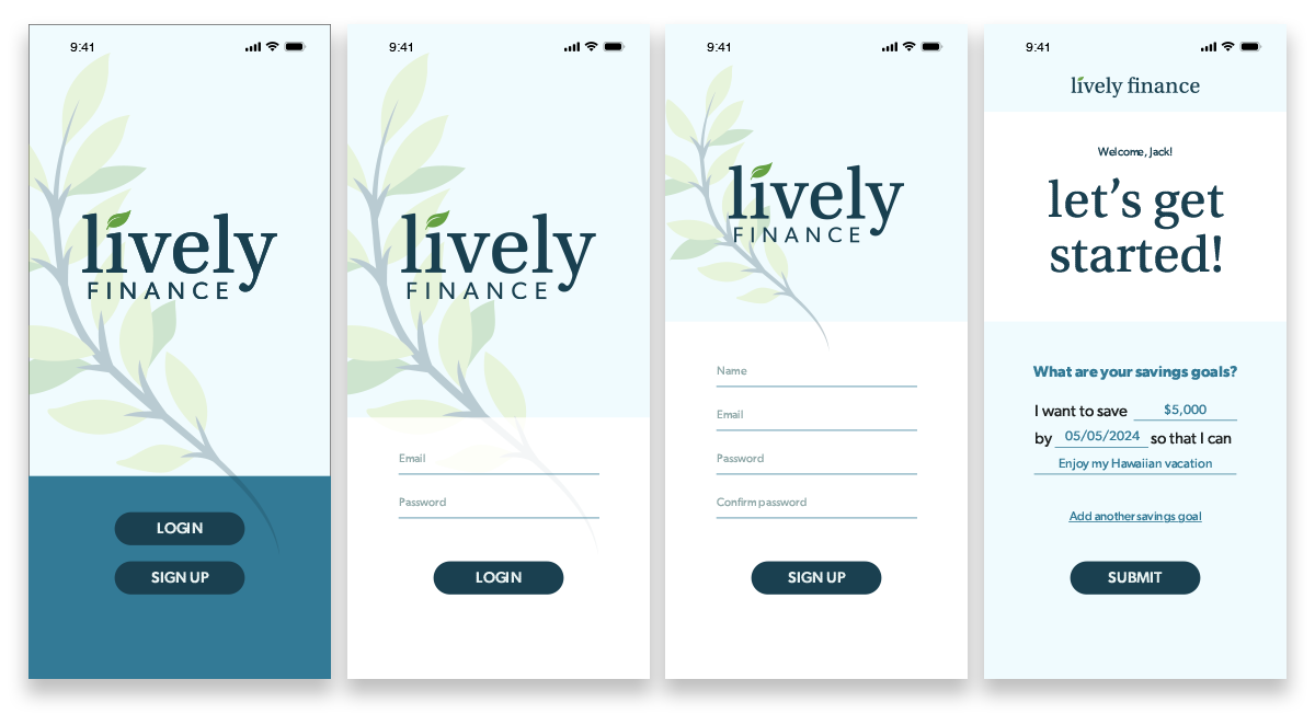
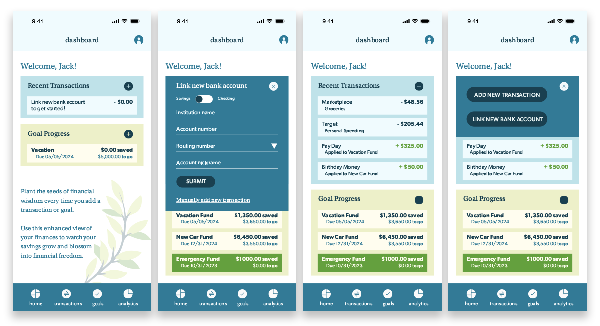
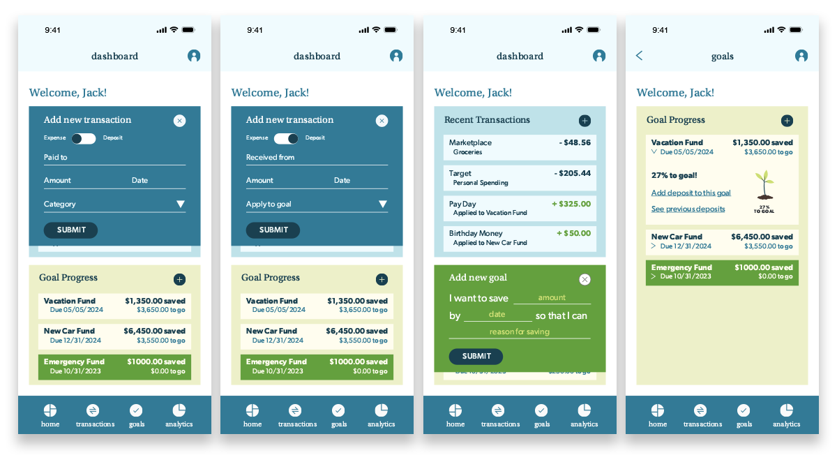
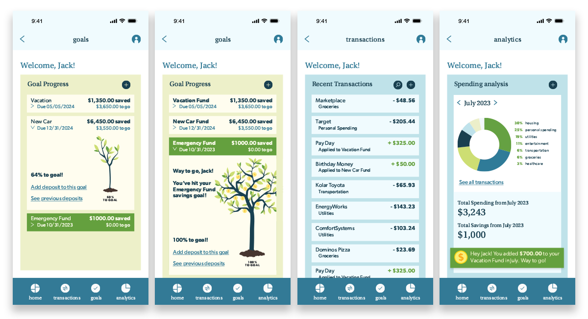
Designs
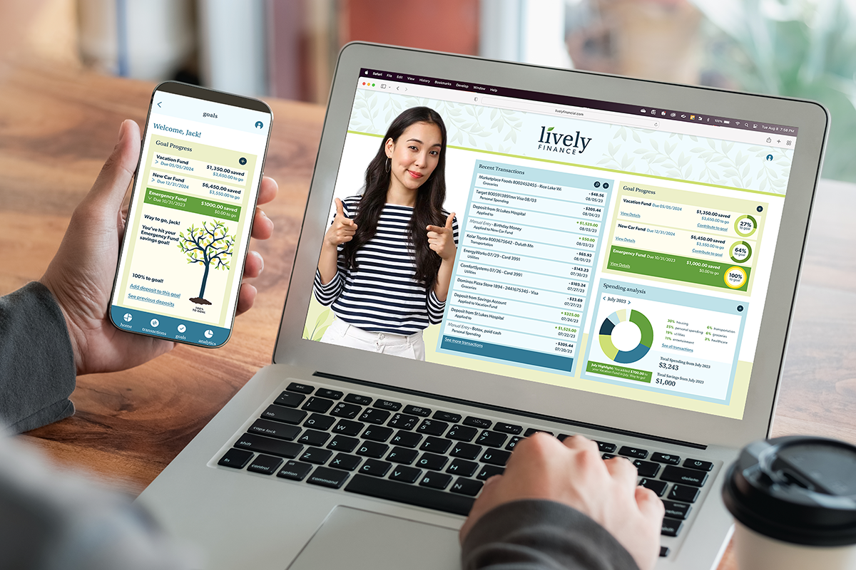
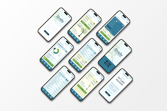
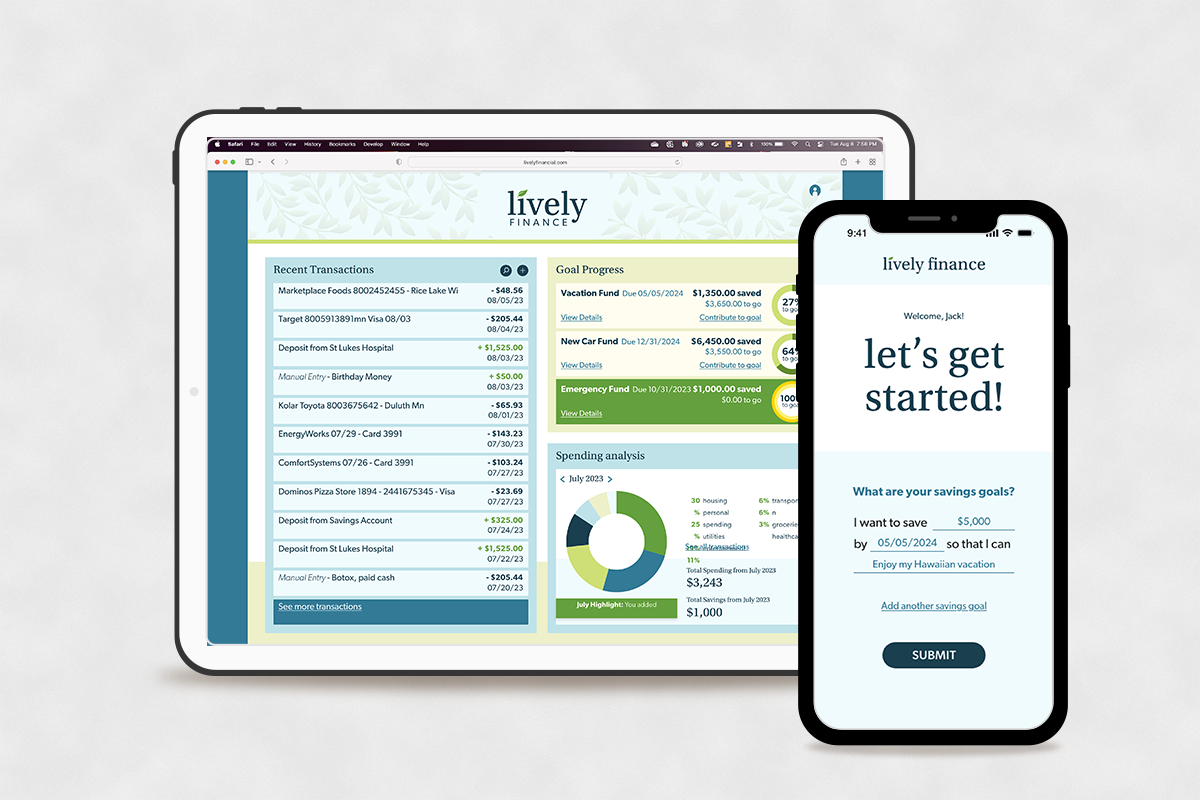
For my mockups, I wanted to make sure they continued to feel approachable and trustworthy.
Conclusion
I learned a lot while creating this product. It was a really fun challenge for me to take on a more analytical project, and there were a few roadblocks where I had to get out of my own head a bit, I’m proud of the results.